Challenge: The objective was to create fun, eye-catching smoothie packaging for children while highlighting the use of natural ingredients, appealing to both children and parents. The challenge was balancing playful elements with clear information that parents would trust.
Solution: I developed vibrant, energetic packaging with fun typography and engaging visuals that instantly attract children’s attention. The clean labeling and emphasis on natural ingredients ensured that the health-conscious aspects of the product were clear to parents. This playful yet informative design helped Yum-O-Rama stand out in a competitive market, becoming a trusted and appealing choice for families.
Deliverables
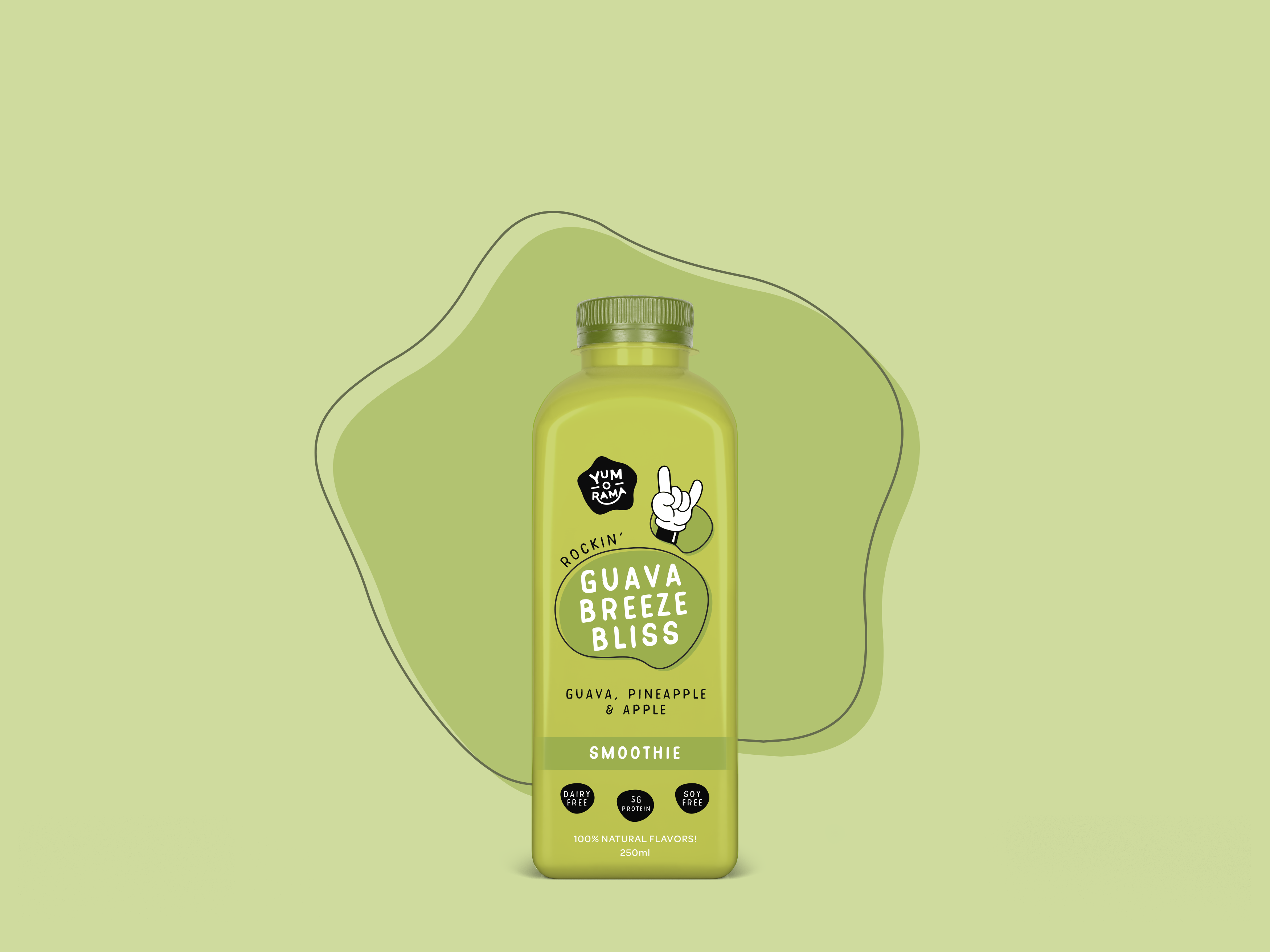
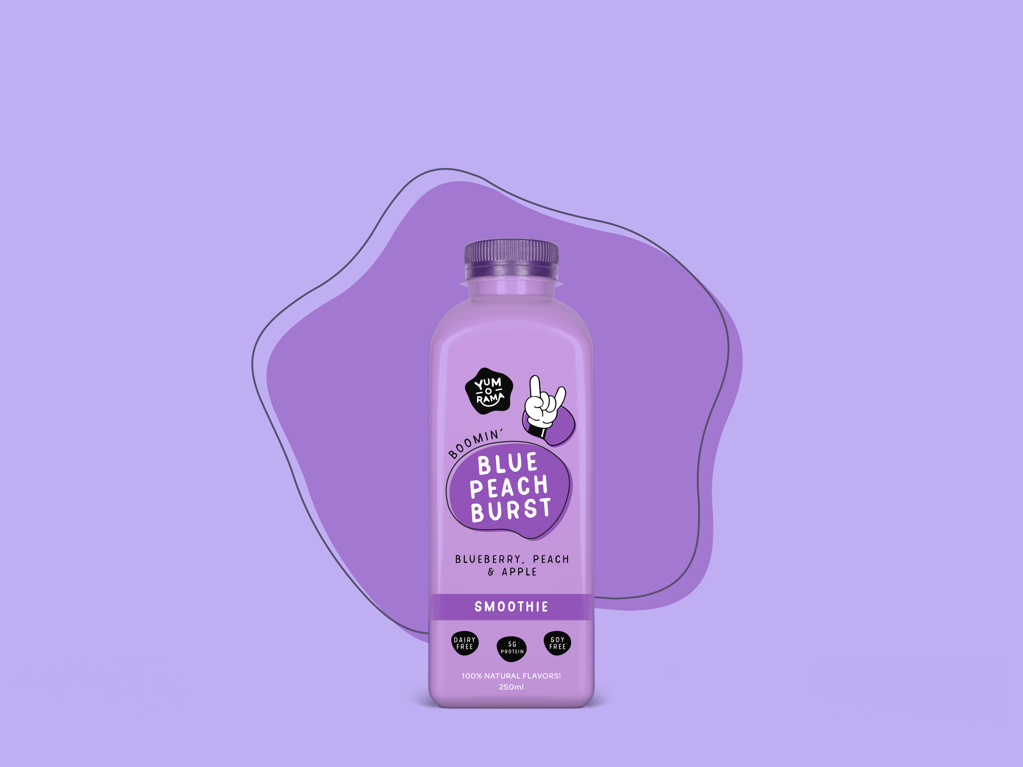
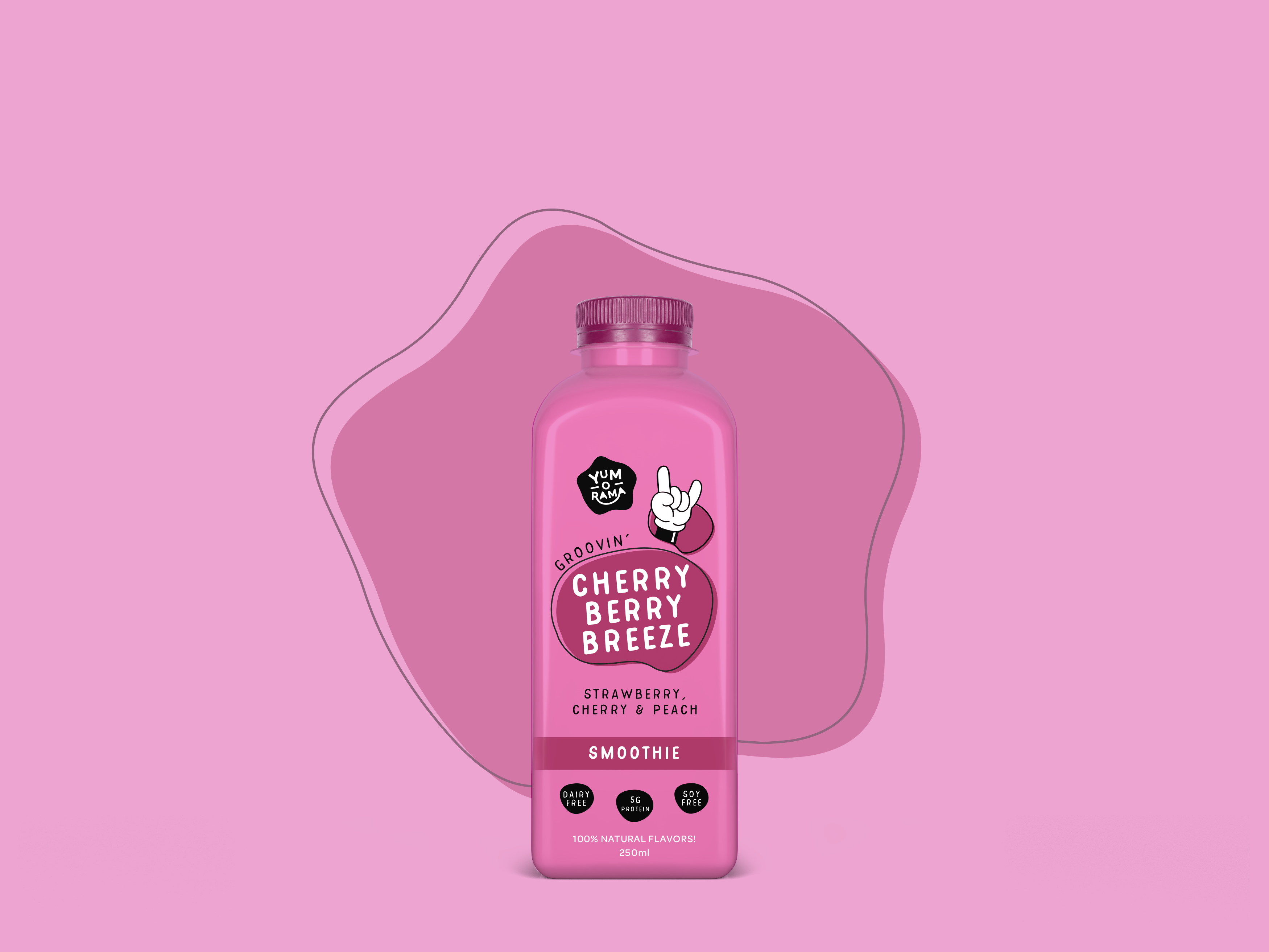
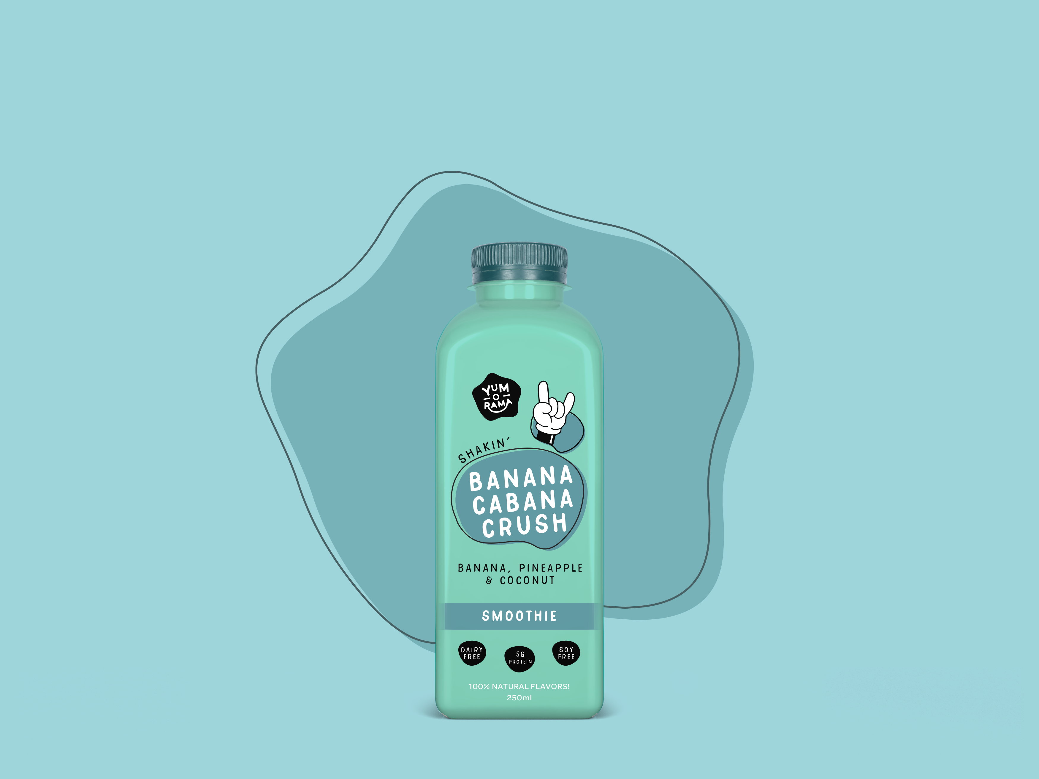
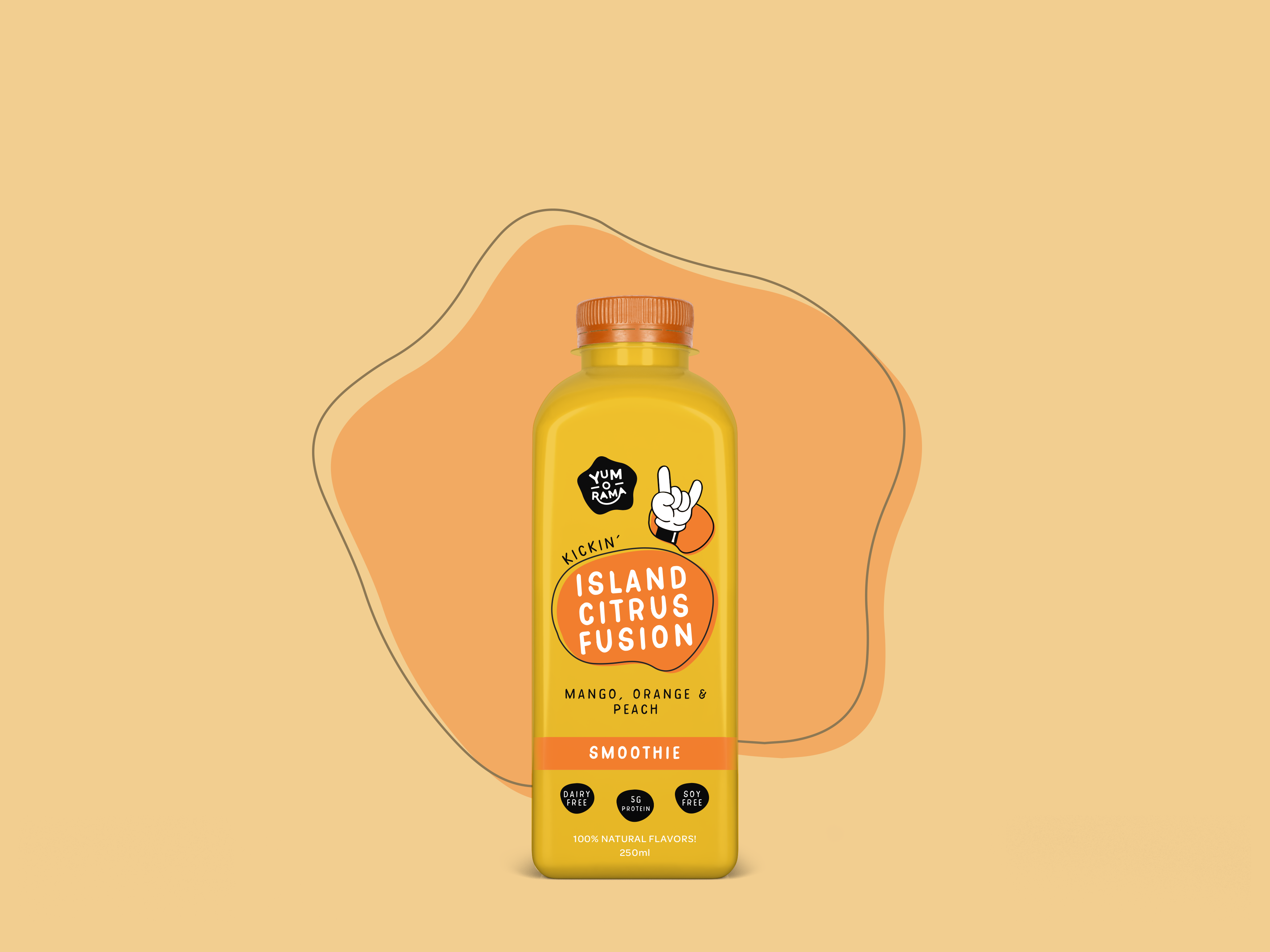
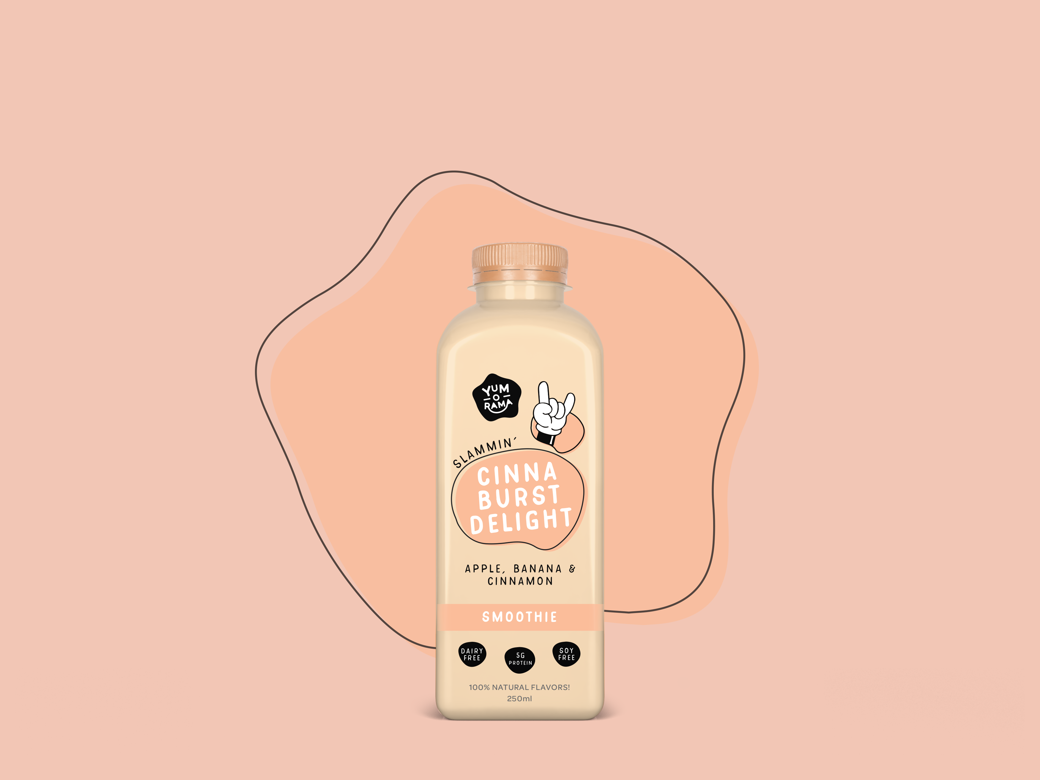
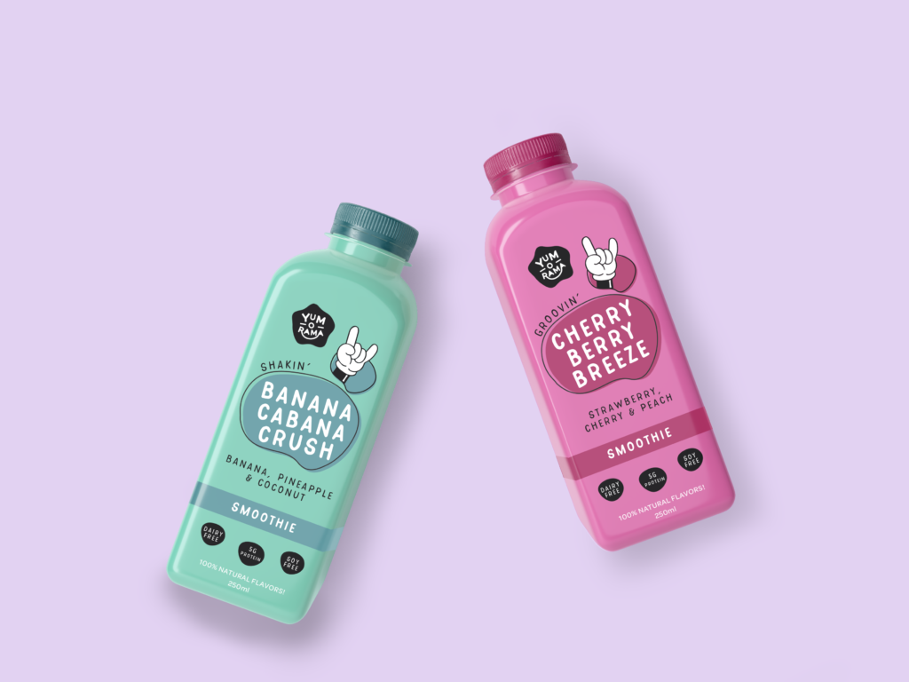
The Yum-o-rama packaging brings the brand’s playful identity to life across six different smoothie flavors. Each bottle features vibrant colors, fun typography, and eye-catching graphics that make them stand out on the shelf. The clean labels emphasize the natural ingredients, ensuring transparency and quality in every sip. Whichever one of the exciting flavors, each design is crafted to appeal to both kids and parents, turning snack time into a fun and refreshing experience.